Every semester, Bard Graduate Center offers Materials Day workshops where students visit craft studios and gain hands-on experience with the materials and techniques that we learn about in class and our own research. In April, my fellow students and I attended two related printing workshops: one on letterpress poster printing and the other on intaglio and ex libris plates. Having recently discussed printing in late nineteenth- and early twentieth-century contexts, I was particularly interested in the technical details of making a clean, crisp print and how artists come to prefer one method over others for their envisioned projects.
The poster printing workshop took place at The Arm in Brooklyn. It was a tiny studio with shelves of antique wood type blocks charmingly stacked all the way to the ceiling. After a quick demonstration of wood type printing by our instructor, I started with a framed tray that ensured my design stayed within the maximum size allowed by the 1960s Vandercook cylinder press in the shop. I picked out letter blocks for the first sentence that came to my mind—“Lesbians are not women,” the closing statement in Monique Wittig’s 1978 essay “The Straight Mind”—and put some Jessie M. King-inspired asterisks between words to underscore the bold, wonderful, destabilising strangeness of the quote. Next came the arduous task of finding spacers of a lower height to fill in every nook and cranny of the tray to prevent the blocks from wiggling around when I placed them under the heavy rolling press. I tried everything I could find, from wooden beams one or two inches wide that spanned the tray’s width to metal chips no thicker or larger than my phone’s SD card. Finally there was the machine: I transferred my Tetris board of blocks to the press bed, inked it with the rollers, fed the glossy poster paper to grippers on the cylinder, and rolled the cylinder over the inked letters to make a poster.
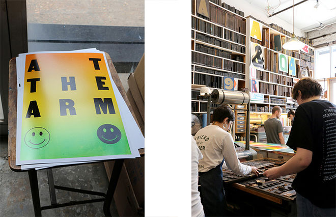
We learned about the intricacies of letterpress: the size of the paper is limited by those of the bed and cylinder of the printer; a maker relies on both orderly shelves and experience to pick out letters quickly; the blocks have to be exactly the same height, and even just two layers of paper tape could make the difference between bold and faint effects. It also took more strength than I expected to operate the machine, and I was thankful for my old shirt and jeans that did not need to stay pristine. Relating this to my interest in women’s labor in the public sphere, I realized that the satisfaction I gained from making these posters came as much from the freedom to move about and feeling capable of controlling a heavy-weight metal object as from releasing words from my mind into the world.
The ex libris printing workshop, led by BGC’s manager of digital humanities and education Julie Fuller and second-year MA student Ana María Orobio Pinzon, introduced a different technique: intaglio printing on a mini 3D-printed etching press made with instructions from the Open Press Project, which makes intaglio printing more accessible. I etched my bookplate design, the mirror image of the expected result, onto a plastic board with an engraving tool that was like a sharp knitting needle. I rubbed ink all over the board with my fingers and cleaned off the excess with newspaper, so that the ink only remained in the grooves. After that, I layered a tissue, my inked plate, a wet cotton printmaking paper, and a thin sponge over the press bed. I fed this sandwich through the press to transfer the ink to paper.
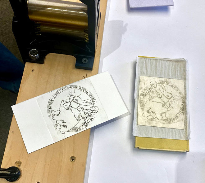
As I’ve been studying Jessie M. King’s book illustrations for my Art Nouveau course, I have seen authors mention every now and then that her delicate lines were lost in printed versions. I had been curious about what factors could hinder this transcription. The lines I made were as fine as if they had been drawn. Some were kinked, however, as it was more difficult to draw curves with the engraving tool than with a pen, and some sections were faint. It took some trials to clean the plate just so, to leave enough ink in the grooves for bold lines. For King, an illustrator of fairytale books and an artist famed for her elaborate details, it must have been frustrating when the printed pages weren’t as smooth and crisp as her drawings. I realise now how much the quality of copies depends on the skills of engravers and printmakers, and how the artist’s drawings remain a treat to look at even though they were intended to be circulated in prints.
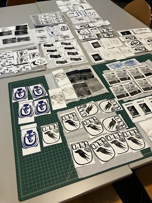
The workshop also offered rubber blocks for relief printing, which relies on the same principle as the letterpress machine but required little space and very fine movement, like the intaglio process I tried. Remembering my own middle school zeal for carving rubber stamps, I think part of the allure was its accessibility; you make something that stores images and could produce as many copies as you’d like, in as many colors as you’d like, with just rubber and a blade. When something goes wrong in a trial, all you need is a new block of rubber, or in the case of the etching press, a new plastic board or even just a sheet of Tetra Pak. Big machines are exciting, but I am also so grateful for these tiny ones for allowing me to keep creating and improving in a more affordable way.
–Sailin Xu, MA ‘27


