Prior to the opening of the exhibition John Lockwood Kipling: Arts & Crafts in the Punjab and London, Bard Graduate Center students were given the opportunity to participate in an Installation Workshop. These workshops offer behind-the-scenes access to students as well as the opportunity to discuss exhibition-related issues with curators, conservators, and exhibition staff.
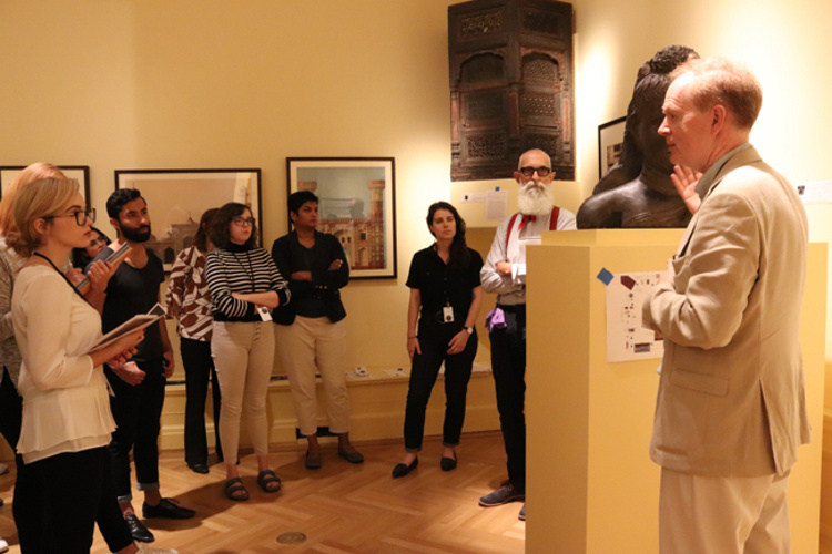
On September 7, Julius Bryant, Keeper of Word and Image at the Victoria and Albert Museum in London, discussed the issues inherent in translating an exhibition from a large museum into a smaller gallery. He explained that certain accommodations had to be made during the installation process to ensure both the safety of the objects and to allow an appropriate amount of space for visitors to move comfortably. He emphasized that while this sense of proximity can be rendered in an installation mockup, when installing on-site many people need to work within a short period of time to gain consensus for the final result. Certain objects may provide a richer experience when seen in the round, such as the plaster cast of a Buddha head from Takht-i-Bahi, now in the Lahore Museum. In situ, however, it was decided that the most advantageous approach to displaying the piece was mounting it on a pedestal against the wall facing out towards the viewer, where access to the back of the piece was no longer possible.
Among Julius Bryant, Susan Weber, BGC Founder and Director and co-curator of the exhibit, and Jeremy Johnston, Exhibition Designer, there was a lively discussion of the differences between working within a larger public institution, such as the V&A, versus a smaller academic gallery, like our Gallery. One interesting example was the wall labels. If typos are found in the wall texts, or changes in color, scale, or typography of object labels are needed to suit the new space, traditional methods of printing may take as long as three weeks and wouldn’t be available until after the show’s opening. BGC has the luxury of reprinting labels as issues arise because of the availability of on-site printing, something the majority of institutions do not have.
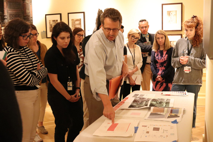
Jeremy Johnston walked students through the choice of paint colors used in the exhibition. In total, forty colors were used in the show, developed from twenty-two paints. The wall color was custom mixed to get just the appropriate tone of turmeric yellow from the early nineteenth century. Color was employed to evoke the richness and vibrancy of the streets in Lahore, Pakistan. These discussions all tie in with the course “Exhibition Design & Curatorial Practice” being offered this fall, in which students will have to internalize these considerations to successfully render (and possibly install) an exhibition of their own design.
—Carson Wos, MA student, second year


